
A living room’s paint color choice is more than just selecting a hue you like; it’s about establishing a mood, telling a tale, and creating an environment you won’t want to leave.
This guide will help you through the entire process, regardless of whether you prefer soft neutrals or are prepared to go all out with something striking and gloomy. Come on, let’s go colorful!
Reflect on Your Personal Style
Your living room is your stage—it should speak you. Before you get lost in paint swatches, pause and think: what truly feels right? Are you drawn to modern minimalism, boho-chic vibes, or something entirely eclectic?
Start by observing what naturally pulls at you. Do soft pastels make your heart sing, or are you more about earthy tones? Maybe you crave bold, playful pops of color, or luxurious, deep hues that envelop you in warmth.
Extra Tip:
Browse your wardrobe, Instagram saves, or Pinterest boards. Lots of crisp whites and navy? Coastal inspiration might be calling. Mustard yellows, earthy reds, and quirky patterns? You’re flirting with mid-century modern.
Another sneaky trick: check your camera roll. Which colors appear in your photos most—sunset skies, forest trails, cozy cafés? They’re clues to your true color preferences.
Consider the Room’s Purpose
Function fuels form. How you use the room should guide your color choices. Is your living room a relaxed movie den, a sophisticated entertaining space, or a multi-purpose hub for family and friends?
Extra Tip:
- For chill zones: soft greens, sandy neutrals, or warm grays create a calming, restorative vibe.
- For formal areas: navy, deep olive, or moody charcoal ooze elegance. Pair them with luxe textures like velvet or brass for drama.
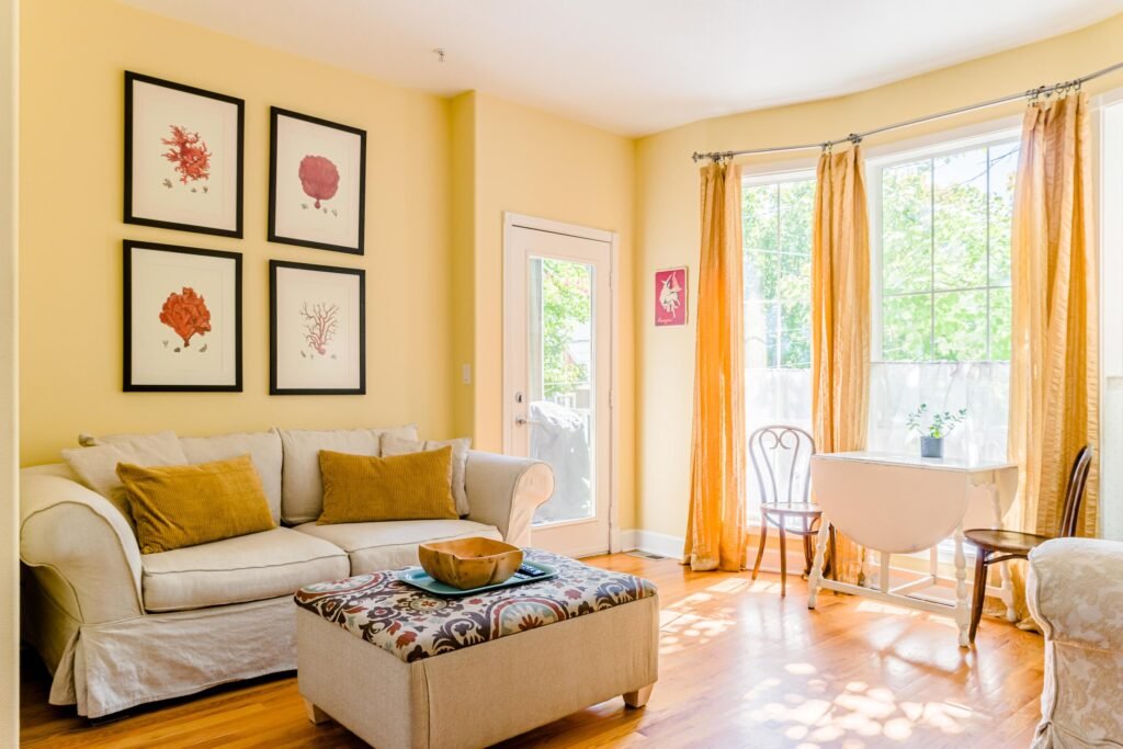
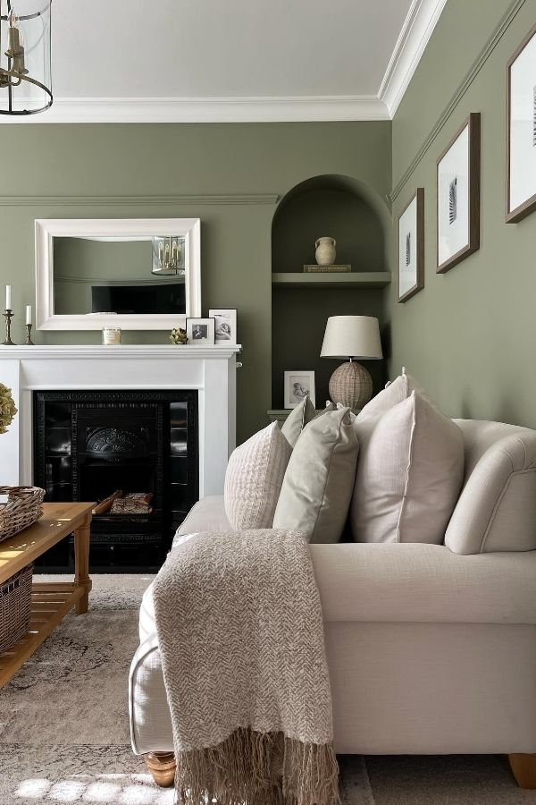
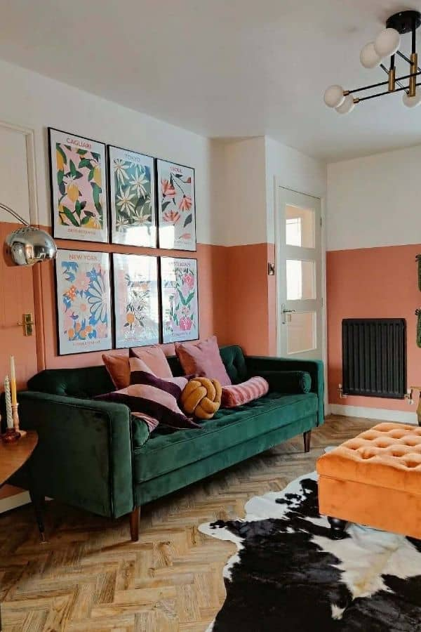
- Want a playful, energetic room? Coral, ochre, or olive green can bring life and joy.
You can also mix moods: muted walls with bold accents, playful throw pillows, or statement art pieces can balance calm and energy.
Play with Natural Light
Light changes everything. That blush you loved online might turn beige in a north-facing room, or that gray might shift blue depending on the hour.
Extra Tip:
- North-facing rooms: Cooler light dominates; warmer tones like creamy whites and soft terracotta balance it out.
- South-facing rooms: Bright all day; colors pop, so test before committing.
- East-facing rooms: Warm mornings, cooler afternoons; soft blues and greens feel natural.
- West-facing rooms: Evening warmth; deep shades come alive beautifully.
Always observe colors at different times of day before deciding.
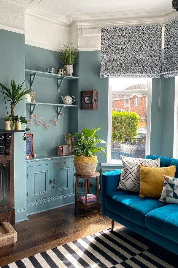
Harmonize with Existing Elements
Your walls don’t exist in isolation. Flooring, furniture, and trims all interact with paint colors. You want harmony, not conflict.
Extra Tip:
- Start with what’s staying: a teal velvet sofa, walnut floors, or marble countertops should guide choices.
- Warm-toned furnishings pair with earthy shades: burnt sienna, terracotta, mossy greens.
- Cool-toned décor favors dustier hues: soft blue-grays or muted neutrals.
- Texture matters: metallics pop on matte walls, while linen and wool look amazing with deeper shades.
Test, Test, Test!

Swatches on a chip are not the same as walls. Samples are your best friends.
Extra Tip:
Paint large swatches on poster board or foam core and move them around the room. Observe morning, afternoon, and evening light. Trust your gut on what feels right, not what looks perfect in the store.
Embrace the Power of Neutrals
Neutrals aren’t boring—they’re the unsung heroes of a flexible, stylish space. They let art, textiles, and personal touches shine.
Extra Tip:
- Cool neutrals: gray with blue undertones feels crisp and modern.
- Warm neutrals: greige, oatmeal, or creamy whites create cozy comfort.
- Add layers with textures: chunky throws, ceramic lamps, and woven baskets enhance interest.
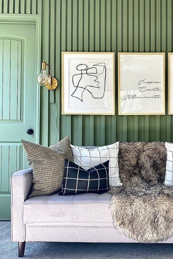
Don’t Shy Away from Bold Choices

Bold colors can transform a room from “meh” to “wow.” Navy, forest green, oxblood, mustard… even bright terracotta or cobalt!
Extra Tip:
- Dark, rich hues add intimacy and sophistication—perfect with layered lighting and plush textures.
- Pair bold walls with neutrals, wood, or natural materials to balance intensity.
- If a full room feels daunting, start with an accent wall, painted ceiling, or a single bold furniture piece.
Think About the Finish
Finish affects mood, durability, and appearance:
- Matte/Flat: Soft, contemporary, hides imperfections. Best for low-traffic walls.
- Eggshell/Satin: Subtle sheen, wipeable—ideal for kids or pets.
- Semi-Gloss/Gloss: Reflective, dramatic. Great for trim or statement walls.
Choose finishes that suit your lifestyle and the look you want.
Create Visual Interest with Accent Walls
Accent walls are your opportunity to experiment without committing fully. They’re the statement necklace of the room.
Extra Tip:
- Pick walls with natural focus: behind the sofa, fireplace, or symmetrical areas.
- Add texture with plaster, limewash, or wallpaper for impact.
- Try unconventional placements: lower half of a wall, painted archways, or even ceilings.
Trust Your Instincts
After swatches, tests, and lighting checks, go with your gut.
Extra Tip:
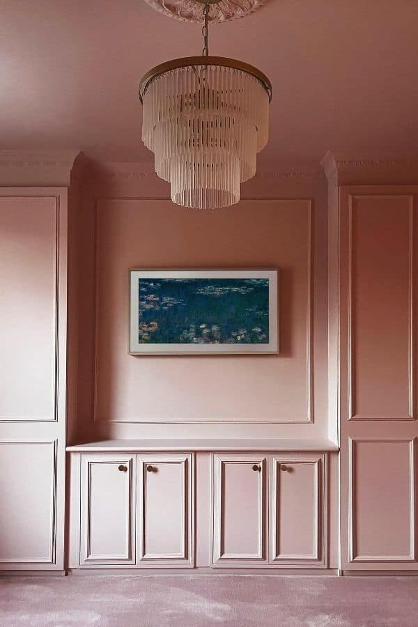
If a stormy lavender, rich ochre, or soft sage makes your heart sing, even if it’s unexpected, that’s the color for you. Color is deeply personal—it should comfort, energize, and inspire daily.
Final Thoughts: Let Your Living Room Tell a Story
Your living room isn’t just walls and furniture; it’s the backdrop to laughter, conversations, lazy Sundays, and cozy evenings. The paint you choose sets the tone, reflecting your personality and lifestyle.
Take your time, experiment, and have fun. Whether it’s a soothing greige like “Elephant’s Breath” or a grounding olive green like “Bancha,” trust your instincts and creativity. Your living room should feel like home, a place that sparks joy every time you walk in.