
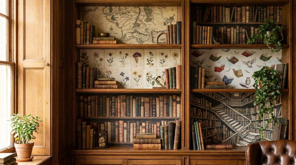
Adding wallpaper inside bookshelves is a simple way to bring color, pattern, and personality to your home without changing the entire room. A beautiful backdrop can make books, decorative objects, and collected treasures stand out while giving ordinary shelving a more thoughtfully designed look.
From delicate florals and classic stripes to bold geometric prints and textured patterns, there are countless styles to explore. You can choose a subtle design that blends with your existing decor or a striking pattern that turns your shelves into a focal point. If you’re looking for an easy way to refresh your bookcases, these wallpaper ideas inside bookshelves offer plenty of inspiration for a stylish makeover.
1. Brighten Built-In Shelves With Light Blue Botanical Wallpaper
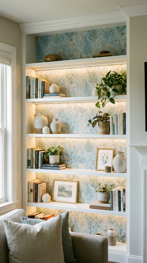
Light blue botanical wallpaper can give built-in bookshelves a fresh, lively appearance. Leafy patterns introduce a natural element, while the soft blue background keeps the design feeling light and inviting. This combination works especially well in living rooms, home offices, and reading corners where a little color can make the space feel more personal.
To create a balanced display, pair the wallpaper with colorful books, small decorative objects, and a few contrasting patterns. Accents in red, yellow, and blue can bring energy to the shelves without overwhelming the botanical design. Choose accessories in different sizes and shapes to create variety while leaving enough open space for the wallpaper to remain visible.
2. Create a Calm Backdrop With Sage and Light Blue Wallpaper
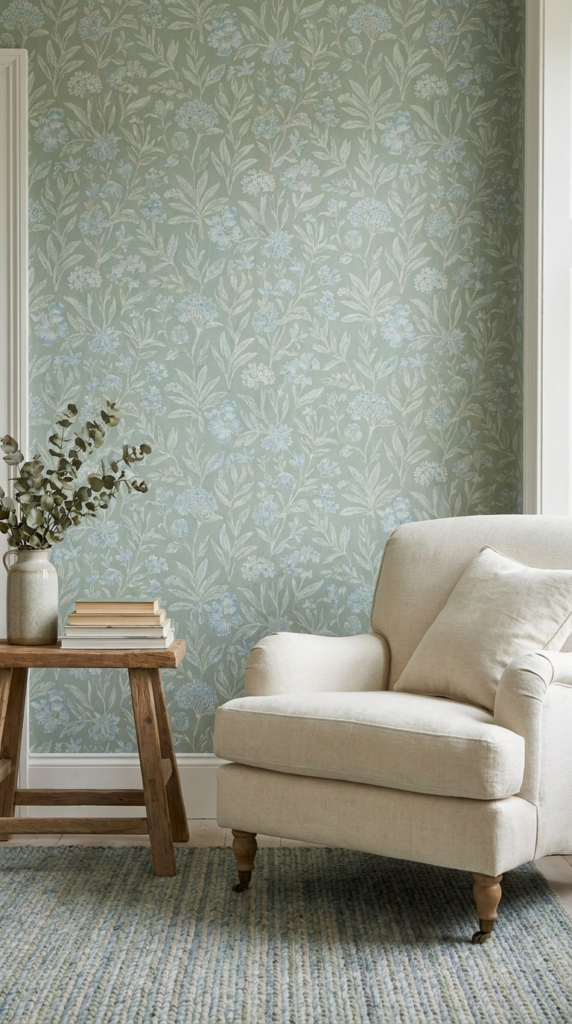
White built-in shelves paired with sage green and light blue wallpaper offer a soothing alternative to bold patterns. These gentle colors work together to create a relaxed atmosphere, making the combination suitable for bedrooms, living areas, and quiet reading spaces.
A simple botanical or understated repeating pattern can add depth without competing with the books and accessories displayed in front of it. White shelving keeps the overall look crisp, while natural wood accents, ceramic vases, and green plants introduce additional texture.
For a cohesive result, repeat one or two of the wallpaper colors in the surrounding decor. Pale blue book covers, sage-colored planters, or neutral storage boxes can tie the arrangement together without making the shelves look overly coordinated.
3. Pair a Turquoise Bookcase With Blue Striped Wallpaper
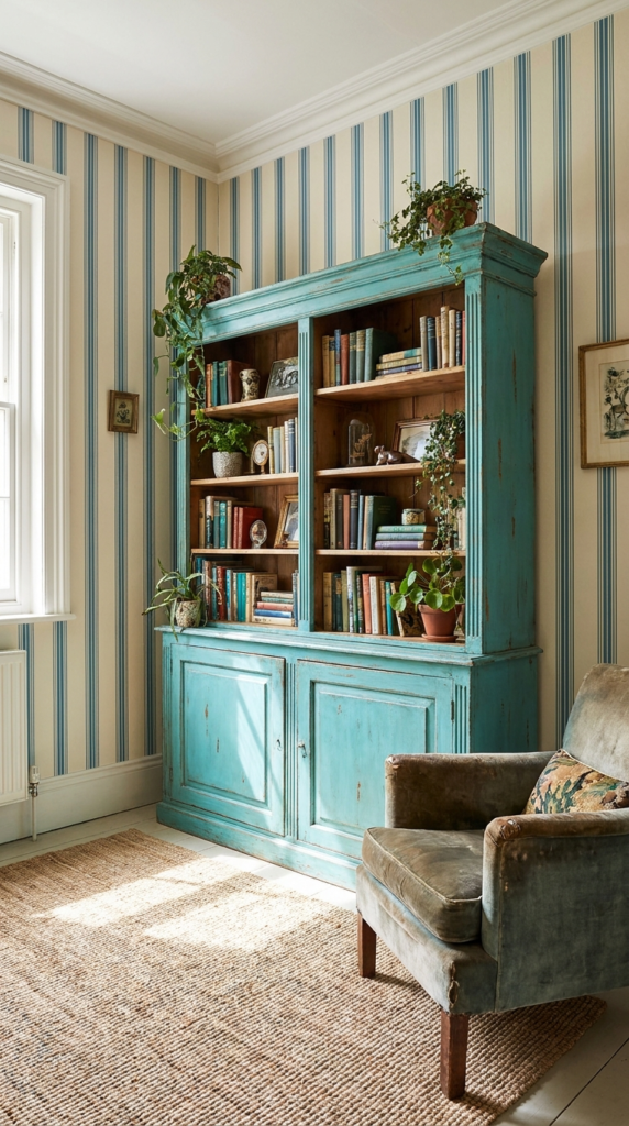
A turquoise bookcase with blue-striped wallpaper inside the shelves creates a bold, contemporary focal point. The contrast between the solid exterior color and the patterned backing gives the furniture more dimension, while the stripes introduce a sense of movement.
This combination can be especially effective when the surrounding walls feature another pattern, such as yellow botanical wallpaper. To keep multiple prints from competing, look for shared colors or differences in scale. For example, narrow stripes can complement a larger leafy print when both designs include related blue tones.
Keep the accessories relatively simple if the room already contains several patterns. White ceramics, neutral bookends, and a few carefully selected colorful objects can help the turquoise finish stand out without making the display feel crowded.
4. Add Personality With Pink Leopard-Print Wallpaper
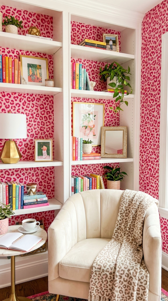
Pink leopard-print wallpaper brings a playful, glamorous quality to white bookshelves. The animal-inspired pattern creates a strong contrast against a clean shelving finish, making it a good option for dressing tables, creative studios, reading nooks, or rooms with an expressive design style.
White shelves help balance the print by providing a simple border around the patterned backing. Decorative objects in pink, black, white, or metallic finishes can reinforce the palette while keeping the arrangement visually connected.
Because animal prints are naturally attention-grabbing, consider limiting other bold patterns in the immediate area. A few well-chosen books, a sculptural vase, or a small framed picture can provide enough decoration without hiding the wallpaper. For a subtler effect, apply the print only to the backs of selected shelves rather than covering a larger wall.
5. Combine Burgundy Shelves With Vintage-Inspired Wallpaper
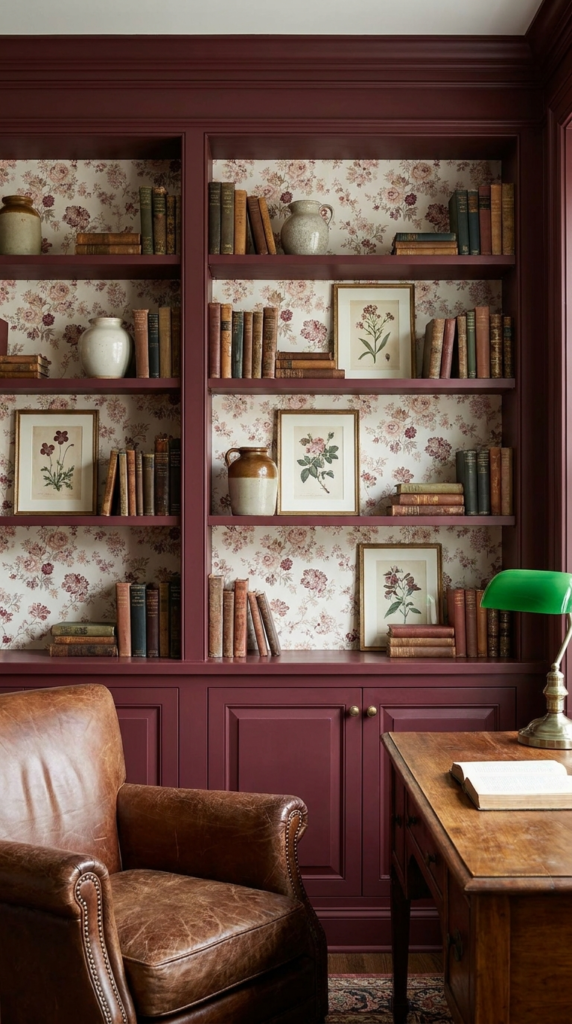
Burgundy shelving paired with vintage-inspired pink, red, and white wallpaper creates a rich, nostalgic atmosphere. The deep red finish gives the shelves visual weight, while the lighter wallpaper introduces contrast and decorative detail.
This palette can work well in traditional living rooms, studies, libraries, or dining areas where a warm, collected look is desirable. Wallpaper with delicate florals, repeating motifs, or heritage-inspired patterns can reinforce the vintage character without making the arrangement feel dated.
Style the shelves with a mixture of hardback books, framed artwork, ceramic pieces, and small objects with personal meaning. Cream and muted pink accessories can soften the darker burgundy finish, while touches of brass or warm wood complement its depth.
To avoid an overly heavy appearance, allow some of the wallpaper to remain uncovered and distribute lighter objects throughout the shelves. The contrast will help both the shelving color and the pattern remain visible.
6. Introduce Soft Color With Yellow and Blue Botanical Wallpaper
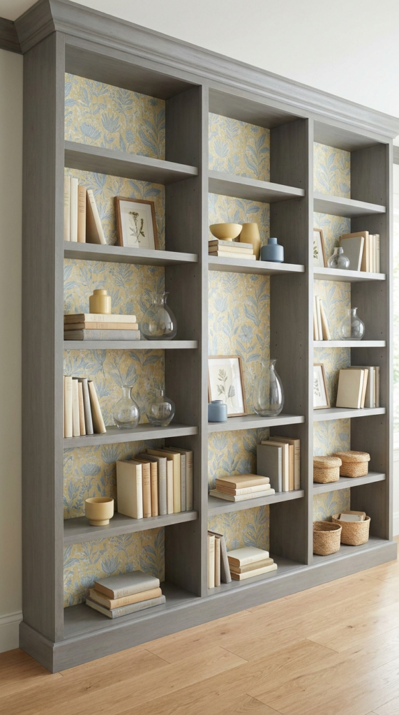
Gray shelving paired with yellow and blue botanical wallpaper offers a balanced mix of neutral and colorful elements. The gray exterior creates a restrained foundation, while the leafy pattern adds warmth and a gentle sense of movement.
This combination is useful when you want patterned shelves without committing to a bright or dark furniture color. Yellow details bring warmth, and blue accents provide contrast, while the gray frame keeps the overall composition grounded.
For styling, consider neutral book covers, small framed prints, glass vases, and simple decorative objects. Repeating yellow or blue in a few accessories can make the display feel connected to the wallpaper. Avoid filling every shelf with decorations, since the open spaces help the pattern stand out.
7. Emphasize Arched Shelves With Taupe Patterned Wallpaper
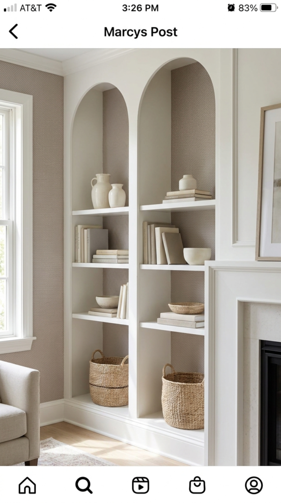
Taupe patterned wallpaper inside arched built-in shelves adds subtle sophistication to an architectural feature. The curved upper section already gives the shelving visual interest, so a restrained wallpaper pattern can enhance its shape without competing with it.
Taupe works well with white, cream, natural wood, and other muted finishes. A small-scale geometric pattern or a softly textured design can introduce detail while preserving a modern, understated appearance.
This approach suits living rooms, entryways, bedrooms, and other areas where built-in storage doubles as a decorative feature. Style the shelves with a mixture of books, neutral ceramics, and a few sculptural pieces. Keep the arrangement relatively simple so the arch and wallpaper remain the main features.
When choosing a pattern, consider the size of each recessed section. Large motifs may become difficult to appreciate in narrow shelves, while smaller designs can create a more continuous appearance across the curved backing.
8. Bring Nature Indoors With Green and Beige Patterned Wallpaper
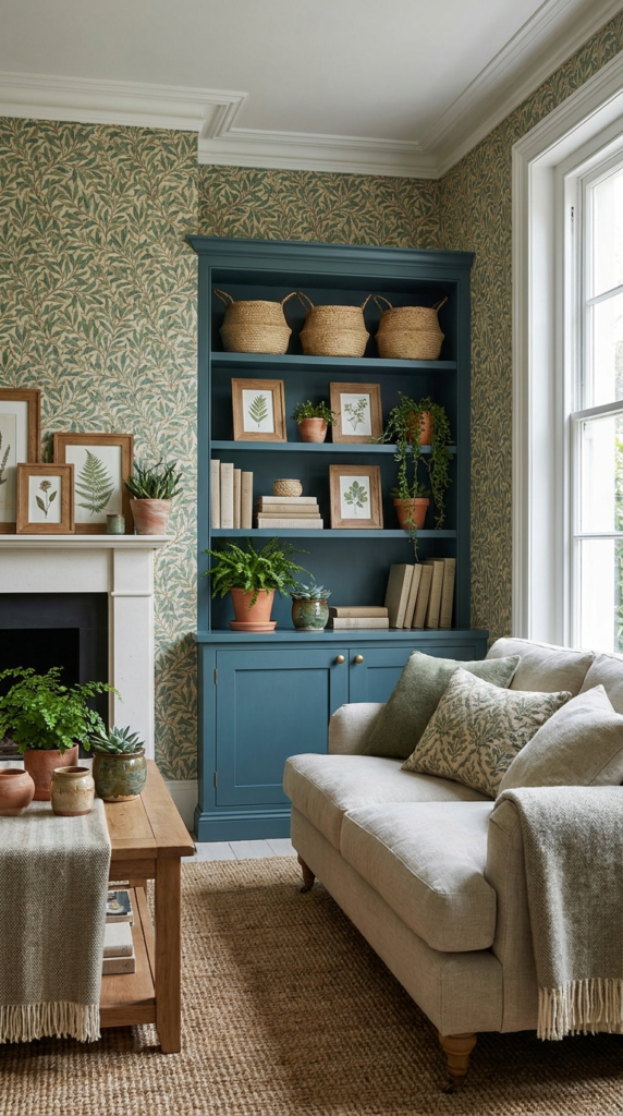
Blue-green built-in shelving paired with green and beige patterned wallpaper creates a nature-inspired color scheme. The combination feels grounded because the shelving and wallpaper share related earthy tones, while the lighter beige elements provide contrast.
This palette works particularly well in rooms decorated with natural materials. Wooden picture frames, woven baskets, linen-covered books, and ceramic planters can complement the botanical influence without making the display look overly themed.
For a cohesive effect, choose wallpaper that includes at least one shade close to the shelving color. A slightly lighter or darker pattern can add depth while allowing the furniture to retain its identity.
The approach is versatile enough for contemporary interiors as well as relaxed, traditional spaces. If the wallpaper features an intricate motif, keep some shelves relatively uncluttered. This allows the pattern to contribute to the design instead of disappearing behind the accessories.
9. Use Light Blue Plaid Wallpaper Inside Navy Shelves
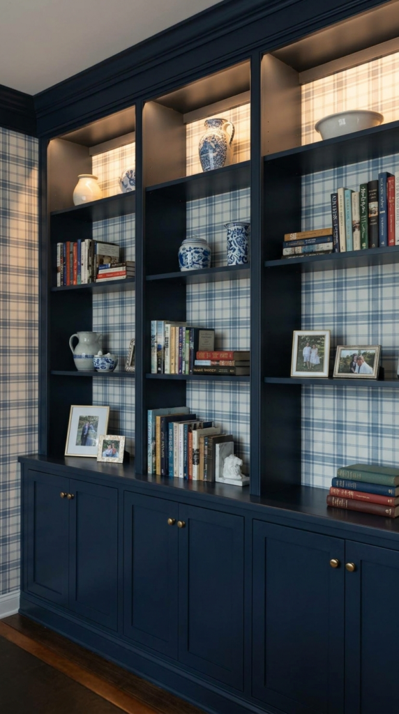
Navy built-in shelves with light blue plaid wallpaper create a classic combination with a fresh, contemporary feel. The deep blue exterior frames the lighter pattern, making the backs of the shelves stand out and adding visual depth to the arrangement.
Plaid is a versatile choice because it can feel traditional, casual, or modern depending on the scale and colors of the design. A fine grid tends to look subtle, while wider lines create a more noticeable decorative feature.
This pairing can suit home libraries, studies, family rooms, and bedrooms. White or cream accessories help brighten the darker shelving, while natural wood and muted metallic details introduce warmth.
When styling the shelves, mix books of different heights with a few decorative objects. Avoid placing too many items directly against the wallpaper, since the visible grid helps define the overall look. Repeating light blue in a nearby cushion, artwork, or rug can also create a stronger connection between the shelves and the rest of the room.
10. Add Warmth With Yellow and Taupe Textured Wallpaper
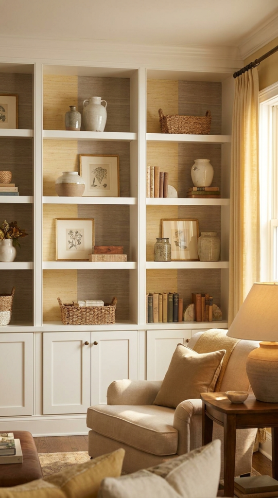
Textured yellow and taupe wallpaper inside white shelves introduces warmth without relying on a complicated pattern. The combination of pale yellow and earthy taupe creates a soft backdrop, while the white shelving keeps the overall design feeling bright.
This option is well suited to rooms that need a little color but benefit from a restrained palette. A subtle woven effect, understated geometric motif, or lightly distressed pattern can provide depth without distracting from the displayed items.
Consider styling the shelves with cream ceramics, neutral book covers, pale wood accessories, and a few accents in warm yellow. These elements complement the wallpaper while preserving its gentle appearance.
Lighting also influences how this combination looks. Warm lighting may emphasize the yellow tones, while cooler daylight can make the colors appear more subdued. Testing a wallpaper sample against the shelves in different lighting conditions helps ensure the finished result suits the room.
11. Choose Beige Shelves With Subtle Blue Patterned Wallpaper
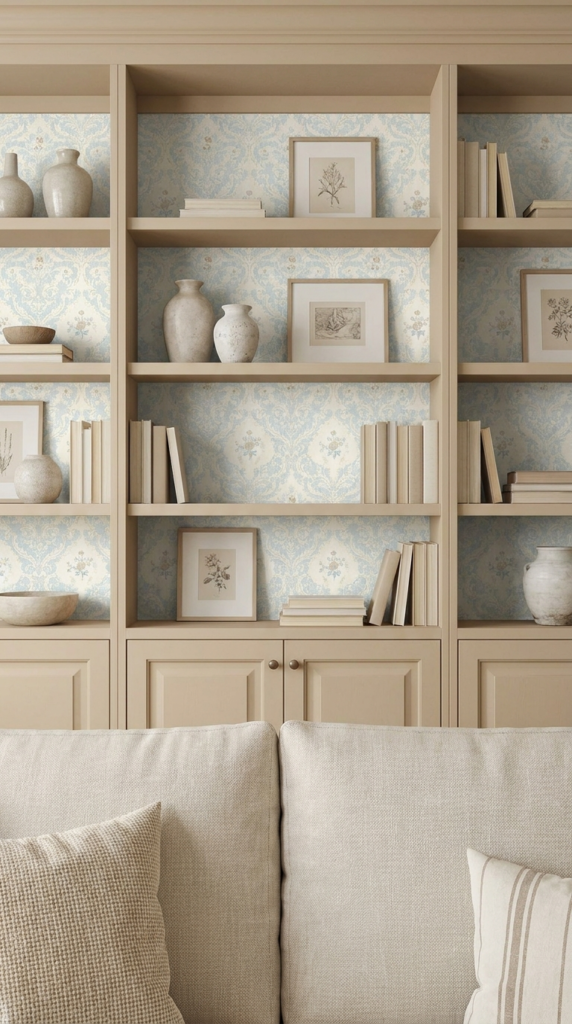
Beige shelving with subtle blue patterned wallpaper creates a refined look that feels calm rather than stark. The beige finish adds warmth, while the blue backing introduces enough contrast to distinguish the shelves from the objects placed in front of them.
This combination is particularly useful for neutral interiors where a strong accent color might feel out of place. A delicate floral, small geometric design, or understated repeating motif can provide interest without changing the overall mood of the room.
For accessories, consider white ceramics, pale blue glass, natural wood, and books with cream or muted covers. These finishes complement both the shelving and the wallpaper without creating too many competing colors.
The key is to maintain a clear visual hierarchy. Let the wallpaper provide the pattern, the shelves define the structure, and the displayed objects supply the finishing details. Leaving occasional empty spaces can make the entire arrangement appear more intentional.
12. Create a Coastal Look With Blue Seagrass Wallpaper
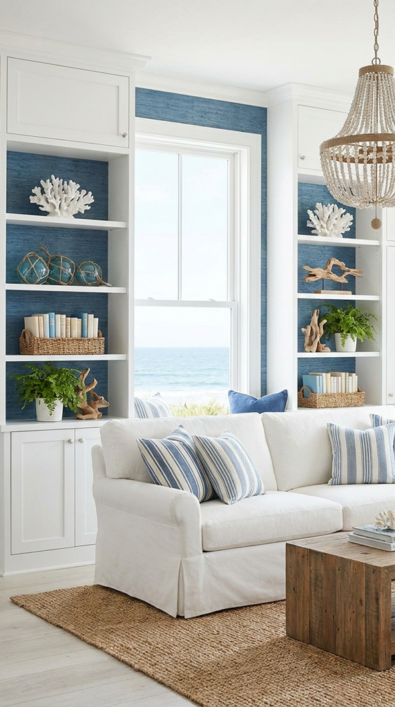
Blue seagrass wallpaper inside white built-in shelves introduces a relaxed coastal influence. Its woven or grasscloth-inspired appearance can add texture, while the blue color recalls the sea and gives the shelving a fresh, airy quality.
White cabinetry creates a clean border around the textured backing, making the blue more noticeable without requiring a dark or highly saturated furniture finish. The combination works well in coastal-inspired living rooms, guest bedrooms, sunrooms, and casual reading spaces.
Decorative accessories can reinforce the look through natural materials and simple shapes. Consider pale wood, woven baskets, white ceramics, clear glass, and a few objects in sandy beige tones. These details complement the coastal palette without relying entirely on themed decorations.
If using genuine grasscloth or another natural-fiber wallpaper, check the manufacturer’s care and installation guidance. Textured wall coverings can be more difficult to clean than smooth wallpaper and may be unsuitable for areas exposed to moisture or frequent spills. A suitable printed alternative can offer a similar visual effect with easier maintenance.
13. Make a Statement With Paleolithic-Inspired Wallpaper
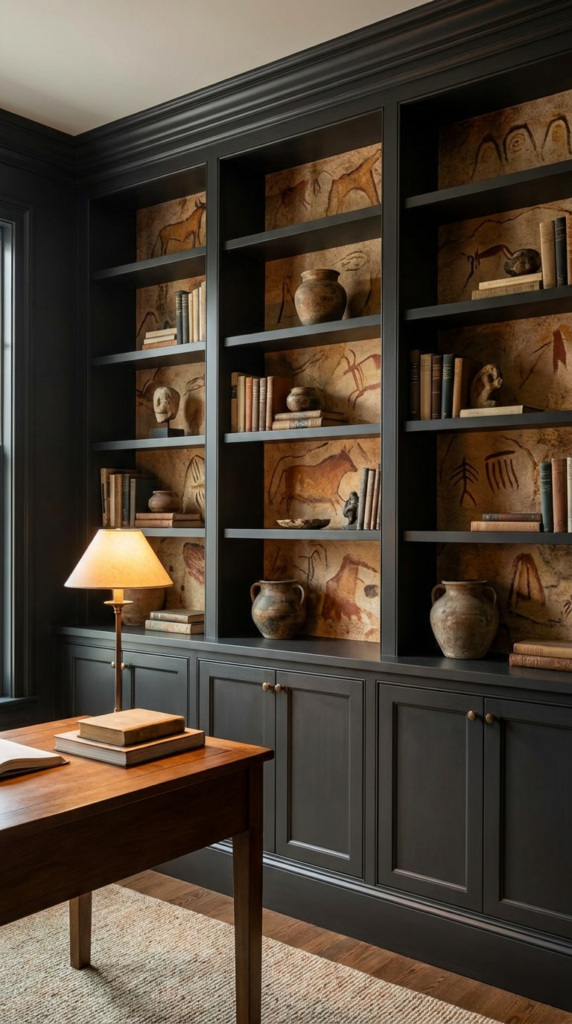
Paleolithic-inspired wallpaper inside dark built-in shelves can create a dramatic, layered appearance. Depending on the design, the pattern might feature abstract organic shapes, stone-like textures, earthy marks, or motifs that suggest ancient landscapes and natural materials.
Dark shelving provides a strong frame for this kind of wallpaper, allowing its texture and tonal variations to become a prominent feature. The result can feel moody and distinctive, especially in a study, library, or living room with warm lighting.
To keep the arrangement balanced, use a limited range of accessories. Dark ceramics, natural wood objects, neutral books, and subdued metallic accents can complement the backing without covering it completely.
The scale of the design matters. A bold pattern may work best across broad shelves, while a smaller motif can be easier to appreciate in narrow compartments. Before installation, place a sample behind a few books and decorative objects to see how much of the design will remain visible.
14. Keep Things Modern With Gray and White Geometric Wallpaper
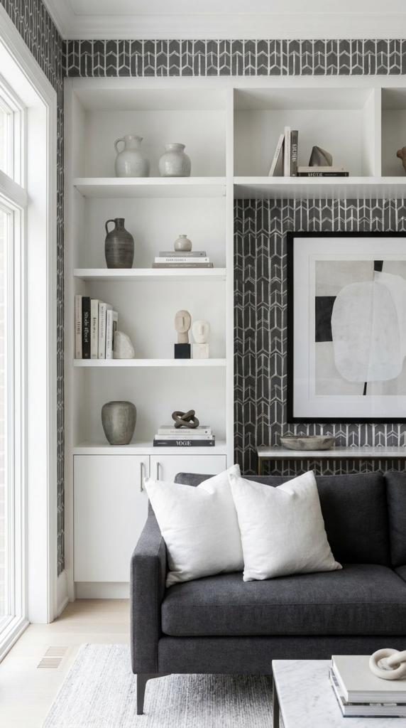
Gray and white patterned wallpaper inside white shelves offers a clean, contemporary appearance. The monochromatic palette creates contrast through pattern rather than bright color, making it suitable for minimalist rooms, modern home offices, and living spaces with restrained decor.
Geometric prints can range from delicate grids to more prominent repeating shapes. A small-scale pattern provides subtle texture, while a larger design makes the shelving more visually expressive.
Black-and-white accessories can strengthen the monochromatic look. Consider simple bookends, framed line drawings, sculptural objects, or a few black decorative pieces distributed across the shelves. Natural wood can soften the contrast if the room begins to feel too stark.
White shelving also allows the pattern to remain the primary decorative element. For the best result, avoid filling every compartment with objects of similar size. A mixture of books, framed pieces, and open space will make the display more dynamic while maintaining its clean appearance.
15. Add Southwestern Character With Neutral Cactus Wallpaper
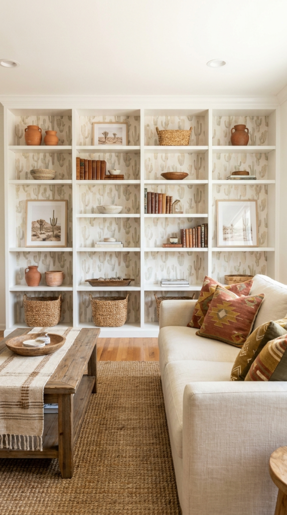
Neutral cactus wallpaper inside white built-in shelves provides a subtle reference to Southwestern design. Rather than relying on vivid colors, a muted pattern can introduce botanical character while keeping the overall room light and understated.
The white shelving works as a simple frame, helping the cactus motif remain visible without overwhelming the surrounding decor. This approach can complement contemporary interiors, casual living rooms, bedrooms, or home offices that use warm neutrals and natural textures.
For a coordinated display, consider terracotta-colored ceramics, light wood, woven baskets, and books in cream, sand, or muted green. These accents echo the desert-inspired palette without requiring every accessory to follow the same theme.
The wallpaper’s contrast and scale should suit the size of the shelves. A delicate motif can be especially effective in smaller compartments, while a more noticeable print may work better across a broad built-in unit. Keeping the surrounding walls relatively simple can also help the patterned backing stand out.
16. Decorate Bar Shelves With Light Blue and Pink Blossom Wallpaper
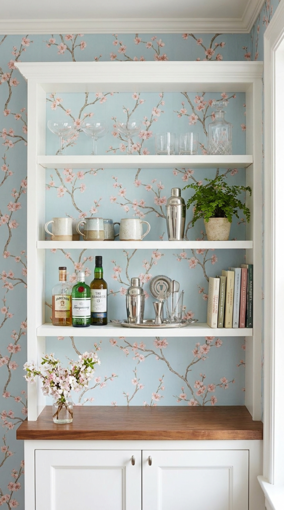
Light blue and pink blossom wallpaper can give bar-area shelving a playful, decorative finish. The combination of soft blue and floral pink introduces color while creating a backdrop for glassware, serving accessories, and carefully arranged decorative pieces.
This design can work in a home bar, dining room, entertaining area, or compact drinks station. White shelving keeps the arrangement bright, while the blossom pattern adds character without requiring extensive additional decoration.
For styling, group glasses together and leave sufficient space between fragile items. A few coordinated accessories in clear glass, pale pink, or muted blue can complement the wallpaper while keeping the shelves functional. If the area is used frequently, prioritize easy-to-clean surfaces and ensure that displayed objects are stable and safely positioned.
Consider the lighting around the bar as well. Under-shelf lighting can help illuminate the wallpaper and glassware, provided the fixtures are suitable for the installation and kept away from moisture or spills. Warm lighting can create an inviting atmosphere, while neutral lighting may show the wallpaper’s colors more accurately.
Because floral wallpaper already provides considerable detail, simpler accessories generally work best. Allowing portions of the pattern to remain uncovered will help the shelves feel decorative without appearing overcrowded.
17. Embrace Retro Style With Blue Geometric Wallpaper
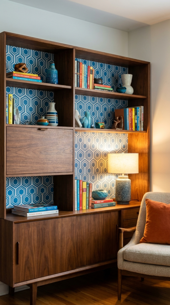
Blue geometric wallpaper inside a large midcentury-inspired shelving unit creates a distinctive retro look. Repeating shapes introduce rhythm and movement, while the blue palette gives the display a strong visual identity.
This approach works particularly well with furniture that has clean lines, simple proportions, and warm wood finishes. The geometric backing can echo the structured forms associated with midcentury design, while colorful books and sculptural accessories add personality.
For a balanced result, choose a pattern whose scale suits the shelving. Large shapes can create a bold focal point across wide compartments, while smaller geometric motifs can provide a more restrained effect. If the surrounding room already includes patterned textiles or artwork, look for a wallpaper design that shares at least one color with those elements.
Accessories in mustard yellow, rust, cream, or natural wood can complement many blue geometric patterns. However, a limited accent palette often produces a more cohesive display than introducing every available retro color.
The shelving does not need to be filled completely. Leaving some areas open allows the pattern to remain visible and gives books and decorative objects room to stand out.